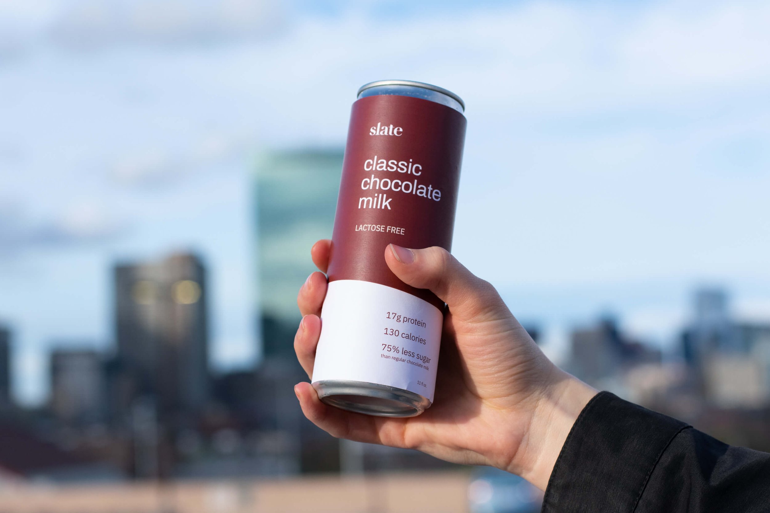
Slate Milk
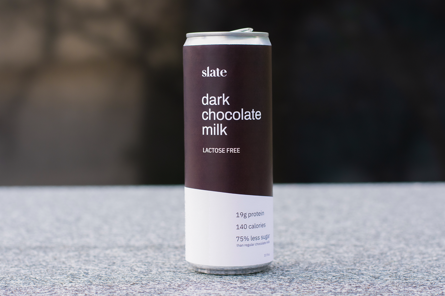
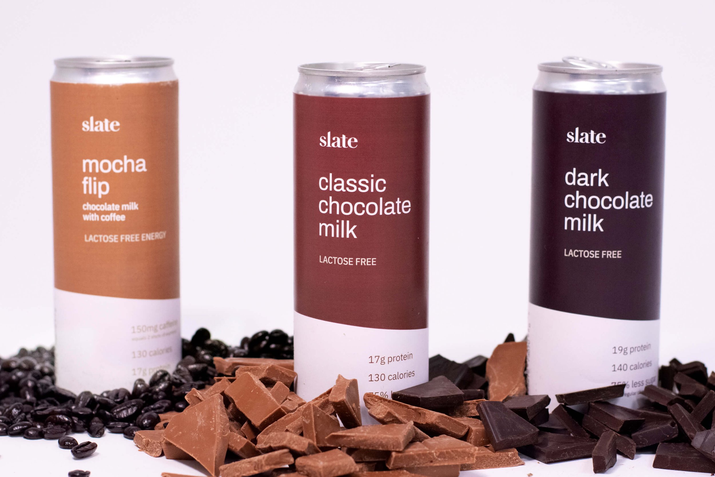
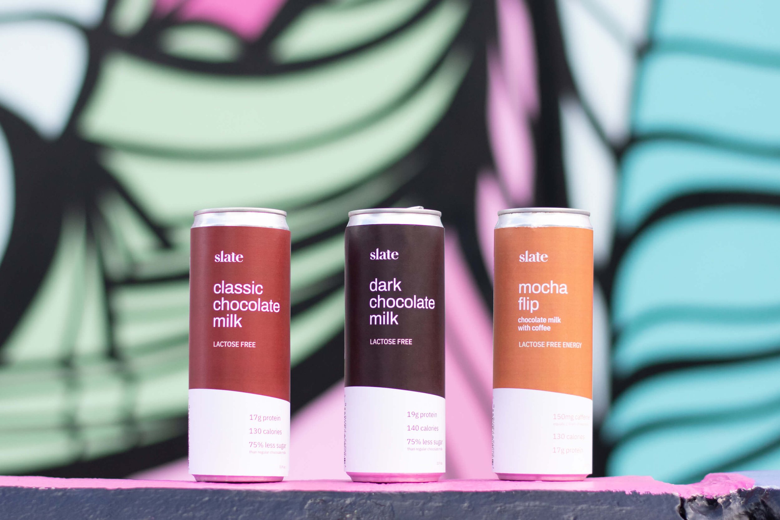
Brand identity, packaging, and e-commerce site for a lactose-free, nutritious chocolate milk brand geared towards health-conscious adults.
Created by a team of developers and designers in Scout Studio in Spring 2019.
Slate founders pitching their product on Shark Tank. 2019.
Brand Development
The brand development phase started with some brand exercises to establish the goals and style of Slate’s branding, and to guide us through the rest of the process.
The clients and our team concluded that Slate’s voice is clever but approachable, and their aesthetic is modern and minimal, but unique to convey their strong personality.
Slate had created some makeshift brand elements before working with us, including a logotype which we refined to better fit their brand vision. This included spacing out the letters for legibility, and incorporating the high contrast line weights that they loved in their original Didot logo.
We also customized the letters to represent the fluidity of milk by making rounded ball terminals that looked like drops of milk on the “s” and “a”, and slanting the tops of the “l” and “t” to allude to a wave, a shape that also appears on the packaging.
Logo + Colors
Process + Collaboration
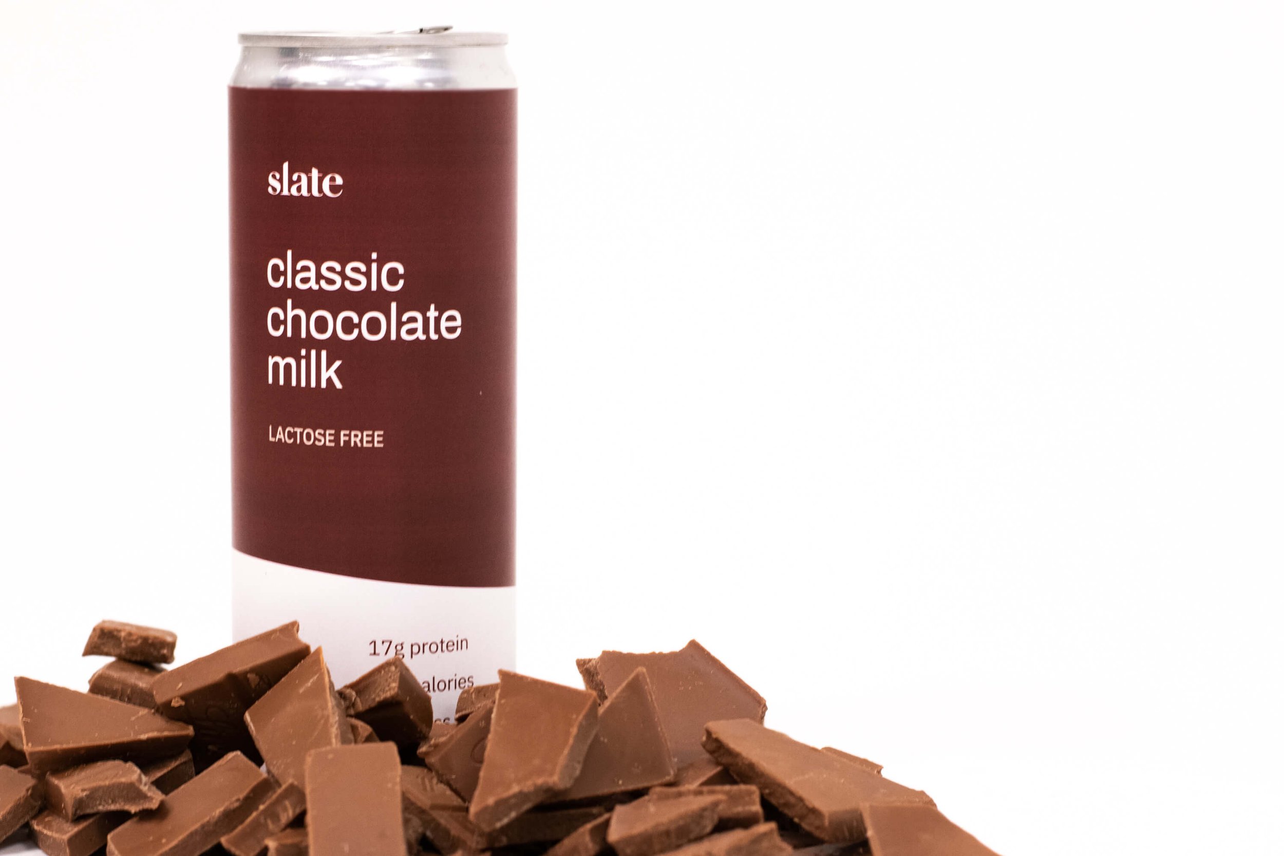
We continued to build out the brand by designing the packaging and website, which included producing physical can mockups to photograph for their website and marketing imagery. We all contributed to the wire-framing process and UI development, until different team members took on certain aspects of the project to focus on. My focus was on packaging, specifically the printing and document logistics, and the production of physical can mockups.

